B

RESUMECONTACTABOUT

Day Made Kaffe

This Summer, a new kaffe is stepping into Seattle. Founded by a barista trained in Copenhagen, the business takes it's inspiration from Scandinavian coffee shops. With a funky lil character and a bold minimalist style, the kaffe can't be missed. Visit Pioneer Square this summer for your new favorite coffee spot!

Bringing Copenhagen to Seattle

When I first met with Ashley Day, owner of Day Made, her goal was to emulate the bold, yet minimal feel of modern cafes in Copenhagen. She trained to become a barista in the city so it was important for her to emphasize this piece of her story. From the very beginning we sought different ways to push this connection, such as using "Kaffe" in the copy and including a character (something commonly found in trendy Scandinavian shops).

The Challenge

From the beginning I knew it would be important for the cafe to gracefully achieve a complex personality, all while connecting to Ashley's experience in Copenhagen. This was fleshed out through a brand discovery session where Ashley and I used spectrum sliders and personality adjectives.


"Day Made is sophisticated, without being unapproachable. Playful, without being corny. New and cutting edge, while also feeling familiar. Overall, it has a nice balance of modernity and charm."

The challenge was to achieve this balance through the visual system and clearly communicate Ashley's story.

Inspiration

We took a lot of inspiration from funky and thick logos, rounded furniture, eyeballs, and simple typography.

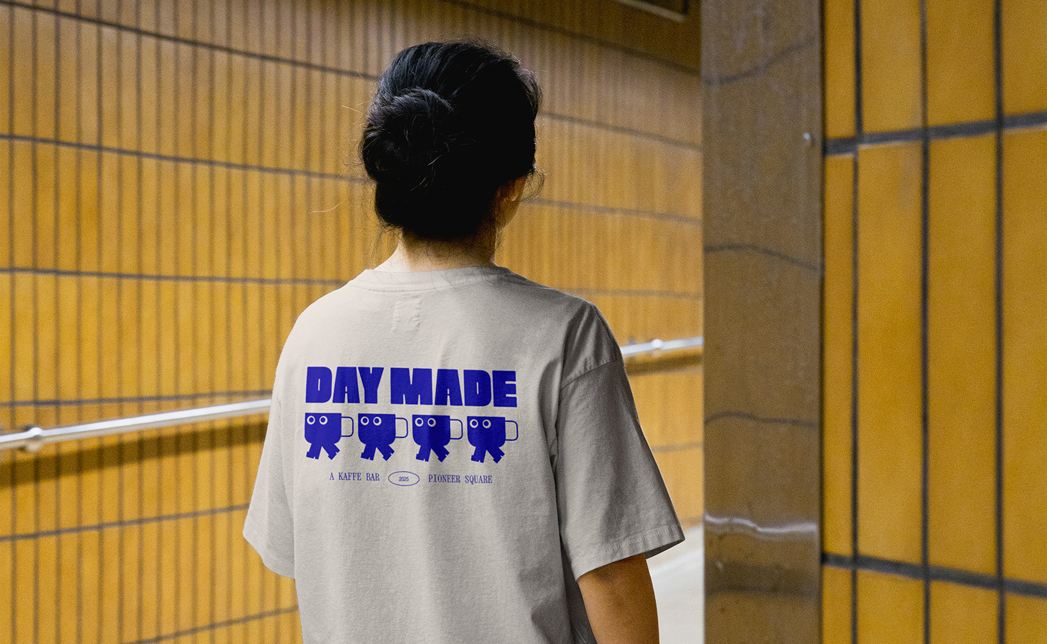
Given the interesting juxtapositions in Day Made's personality, I knew systematic thinking would be important for a cohesive brand.

The system for Day Made included a logo system, typography, color, illustration, and motion. I strategically decided where to keep it more minimally sophisticated and where to amp up the funk. Most of the funky personality landed in the logo and character, while the typography leaned more sophisticated. With all the funkiness in the logo letterforms, I decided to keep the illustration and character cohesive by using the shapes found in the letterforms. This resulted in a visual system that although loud, feels clean and informed.

Logo system

The Day Made wordmark was originally Neil Bold from Canada Type. Through custom lettering, the mark was formed. By softening the edges and thickening the letterforms, a bold, approachable, and playful wordmark came to life.

The icon was formed after the wordmark. Directly using the letterforms, the mascot fits right in. The body of the mascot was made using the D and the legs were made from the A. The contrast of the thin handle with the thick cup was chosen to mimic the high contrast of the A.

Illustration

I also directly took forms from the wordmark and used them to create a variety of utensils and products. This created some flexibility for Ashley to highlight her variety of products, all while staying on brand.

To create a library of illustrations, I had to keep a system in mind. I only used forms found in the wordmark to create illustrations. I also only used one weight of handle or line for the thinner elements. When introducing a new element, such as a the handle on the espresso portafilter, I made sure to use that element in at least one other illustration. This kept the library more cohesive as a whole.

Typography

I didn't want to make the type system too friendly, but I still wanted it to still be approachable. I ended up using two condensed typefaces. TeX Gyre Heroes is very contemporary and I chose to bring in Xanh Mono to give it a little bit more retro character.

Color

My client loved colorful palettes but didn't want it to be too loud, so we used some earthy colors to bring moments of grounding. We decided to use a bright blue for the hero, which required consideration for print. Since Ashley was comfortable with using Pantone colors for printing, we matched our blue to Blue072C. For digital formats, we brightened it slightly.

A lot of Day Made's initial presence would be through social media, since it wouldn't be opening for a few months. As part of the project, I made a series of announcement posts for the opening. I also designed several template posts for ongoing brand connection.

NEXT