Simmer

Brand identity and promo material for a DJ duo residency at Otherworld Wine.

B

RESUMECONTACTABOUT
Why Simmer?

The idea of a simmering pot on the stove, slowly intermingling scents and flavors, perfectly represents the environment of a Simmer night. Warm lighting and a comfortable atmosphere encourage everyone to simply be themselves and relax. Over the course of the night Soraya and Alexia skillfully blend a variety of different genres and moods.

Otherworld

Simmer takes place in Otherworld wine, so the identity was influenced by the bar's brand identity. Besides using Helvetica (the bar's typeface) in the identity, I also took the overall look and personality into account. Otherworld looks modern and futuristic, with a touch of retro influence. The personality of the bar is sophisticated and cutting edge, with an approachable sense of humor.

Logo

The Simmer logo was made from Swear. Inherent to Simmer is movement and transformation. Connecting and italicizing the Ms communicates this and also represents the idea of a musical duo.

Texture Treatment

The treatment is applied to most of the event promo material such as flyers and Instagram posts. Evoking the idea of movement and evolution, the treatment adds a nice texture that can be used for all brand elements.

Typography

Due to the constraint of using Helvetica for the body copy, I chose to pair it with Swear for a little extra personality. While Helvetica is used for most of the logistical information on promo, Swear is used to highlight fun phrases. When paired together, Swear is more powerful in the hierarchy.

Color

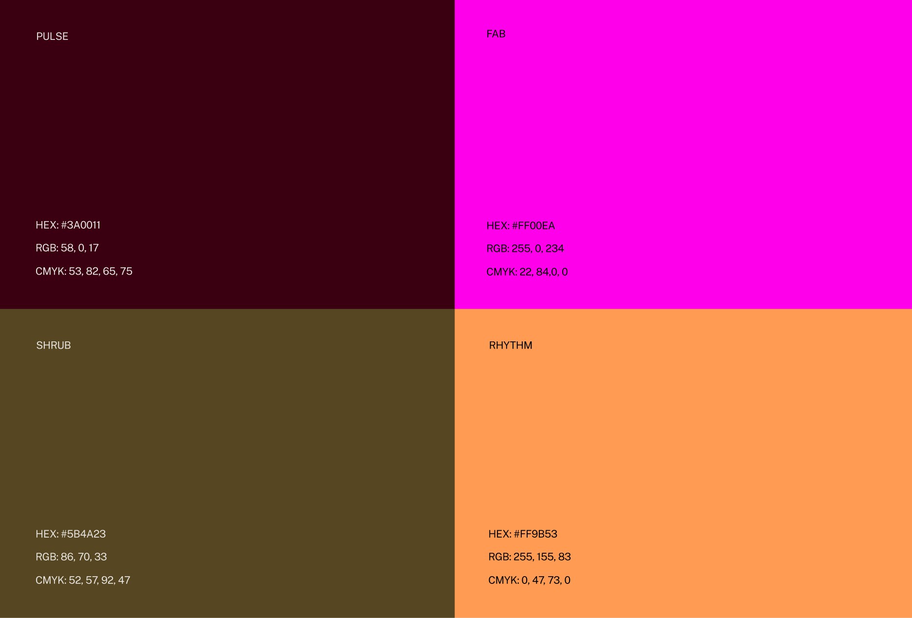
Alexia and Soraya wanted lots of freedom with color so they could create themes based off the month or holiday. To give them a general jumping off point, I recommended using lighter colors over darker colors. This looked best with the texture treatment because it gave the appearance of steam, sparks, or a glow. All of these things contributed to the overall essence of Simmer.

These colors were used for two different Simmer events that I coordinated. We were interested in combining bright colors of tech with moody, muted colors of earth.
Day Made
Hendricks Foundation
Sound of the Sound
Photo Gallery
Simmer
NEXT