
Sound of the Sound
An imagined festival centered around uplifting local artists of the PNW. Backed by research and built with purpose, the festival is filled with substance.
An imagined festival centered around uplifting local artists of the PNW. Backed by research and built with purpose, the festival is filled with substance.

I started the project with the challenge of designing a brand identity within the Arts and Entertainment space that had a positive social impact. To tackle this I followed a process centered in research and ideation.


Within Arts & Entertainment, I chose to focus on problem spaces in the music industry. Due to the era of streaming and effects of the Covid pandemic, independent artists are facing more financial struggles than ever. How can I uplift independent artists?
Within this problem space, I focused my research on local music in the PNW.
Through researching the problem space and also completing a competitive audit of several local music festivals and events I came up with a few key insights and opportunities.
1. I saw an opportunity to feature small, local artists, while still having big local names. This would position the festival as the place to discover and uplift local music.
2. Illustration, bright colors, and bold typography were common amongst the events. I was interested in pushing the envelope to explore other visual techniques besides illustration. I thought this would help the festival stand out more.
3. There is opportunity to emulate the PNW through the visual system. Centering the PNW in the visual system would help clearly communicate the mission of the festival.

PERSONALITY
Bold, eccentric, welcoming, light-hearted.
CORE VALUE PROPOSITION
A three day festival that that uplifts the PNW music scene by empowering the local community.
UNIQUE SELLING POINT
We uplift local artists with an all local lineup, educational and community resources for aspiring artists, and networking events.
VISION STATEMENT
We believe supporting local music artists and talent will lead to a rich and thriving community throughout the PNW.
VALUES
Self expression, empowerment, celebration, community.

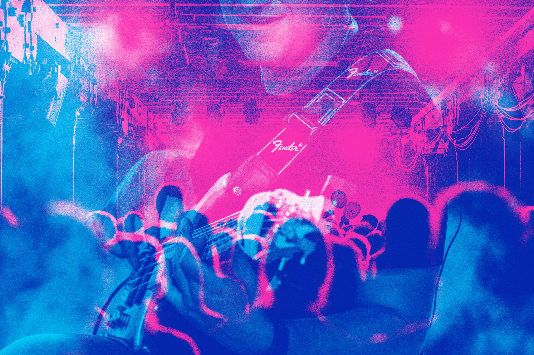
The photo treatment and texture for Sound of the Sound is inspired by riso printing. These vivid colors capture the fleeting beauty of a PNW summer. The use of overlapping colors provides depth and the ability to combine the brand colors in new ways. This connected with the opportunity I saw to incorporate more experimental techniques aside from illustration.


The brand identity for Sound of the Sound is rooted in being a space for independent artists in the PNW.
The salmon, seaweed, and microphone signal the connection to the Puget Sound which is also clear in the festival's name.
When thinking of subtle ways to communicate the festival's mission, I gravitated towards the idea of texture and a handmade feel. This is why I chose to replicate riso printing, a more alternative way of printing filled with texture. I also took this into account when choosing typefaces. Marcus, the logo typeface, is inspired by hand lettering. This element was super important to me because I felt it connected to the idea of independent creation.


