
Hendricks Foundation
Brand identity for a non-profit focused on E-waste recycling. Bringing recycled technology to those in need.
Brand identity for a non-profit focused on E-waste recycling. Bringing recycled technology to those in need.
The Hendrick's Foundation was in need of a rebrand to help vocalize their mission and personality. The project began through discussion with the founder about their goals. He wanted the new logo and brand identity to feel more sophisticated and modern, yet still human.


Through sketching and ideating, I developed the logo and identity. I used the foundation's mission of "Be the Bridge to the Digital Divide" as a guiding phrase for visualization.


It was important to retain the human centered aspect of the brand, while also clearly conveying their role in the tech space.
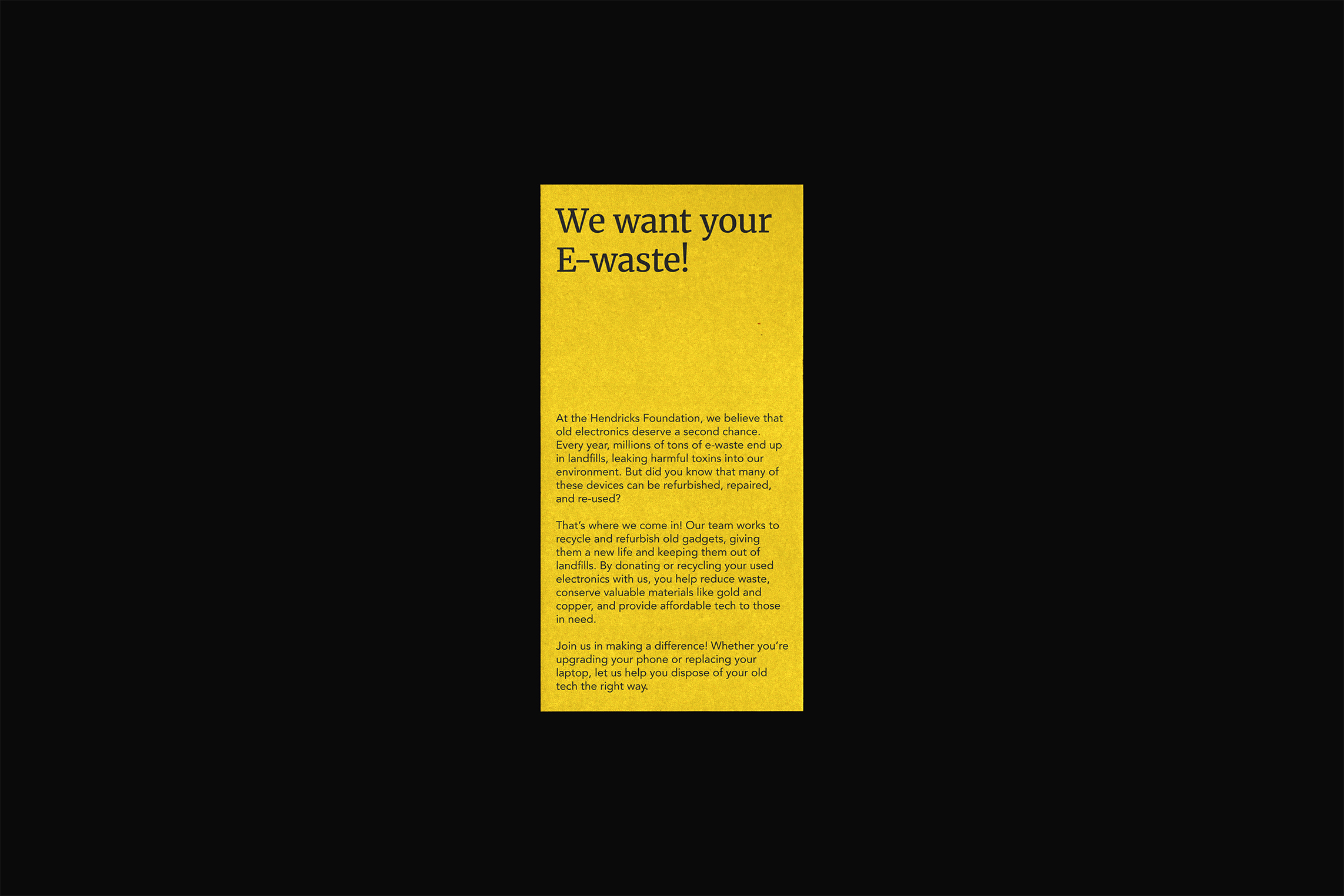
For this reason I made decisions like mixing a serif in and choosing sans serif typefaces that felt open and friendly. The bright bridge yellow and charcoal created a punchy contrast that connected to the idea of electricity and tech, helping the brand stand out from the crowd.
The logo emphasizes the idea of a bridge, while also clearly resembling an H.


